Why do artists refuse to use references why why why.
It’s not a contest to see who can get by without them. It’s not cheating to look at a thing in order to know what the thing looks like.
You don’t get stronger or better by pretending. Nobody is impressed by the awkward whatever-it-is you just drew. Use references.
I don’t think a lot of people know that it’s not cheating. I recall seeing so many piece of art called out because they referenced a pose, someone recognized it, and then proceeded to shame them for it. There’s this belief, both by creators and the audience, that artists should just be able to translate the ideas from their head to paper, and if they don’t, it’s plagiarism, or not true originality (spoiler alert: there’s no such thing).
I myself didn’t start using references until very recently, because even I was under the impression that it was frowned upon. And that belief has seriously crippled and stalled my ability to improve as an artist.
As a restarting artist, I can confirm. I just never knew. I thought you were just supposed to know how to draw the body correctly and if you didn’t you had no talent.
(( I am going to say this again, loud and clear for everyone:
USING REFERENCES FOR ART IS NOT ‘CHEATING’!!!
If you can draw/paint without references, great! But if you need to use them, and feel that your art can be bettered by using references, please, use them! This is one of the biggest tips I can give to artists, is USE REFERENCES!
Anyone who would dare to attack someone for using references after ‘recognizing a pose’ is a dipshit, who doesn’t know a thing about art.
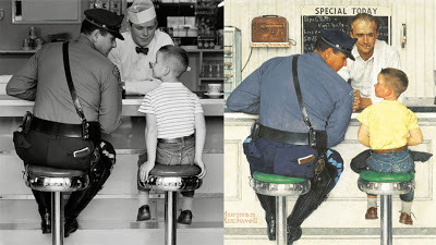
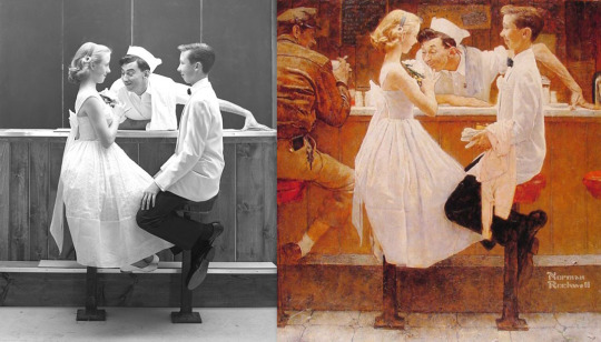
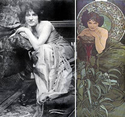
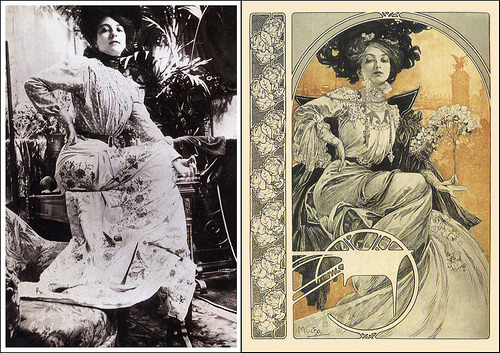
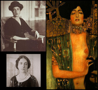
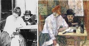
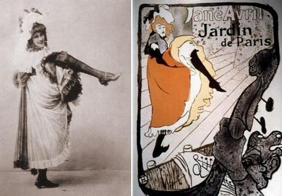
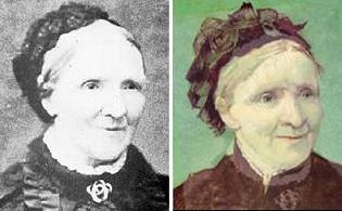
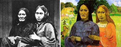
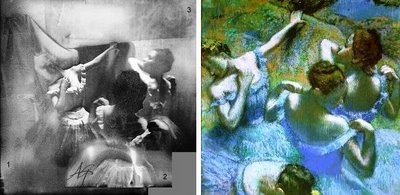
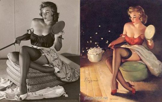
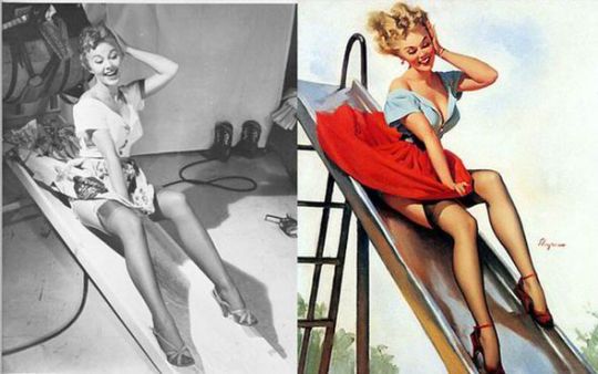
Do you know who else used references for their art?
Norman Rockwell
Alphonse Mucha
Gustav Klimt
Toulouse Lautrec
Vincent Van Gogh
Paul Gauguin
Edgar Degas
Gil Elvgren
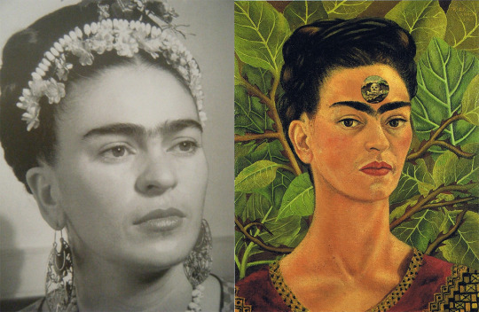
Frida Kahlo
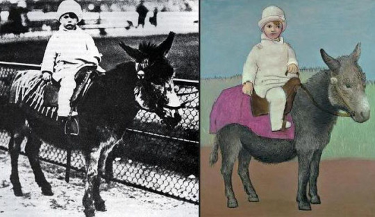
Pablo Picasso
Disney Studios
And thousands of others! So, artists! Go forth, and use references!!! ))
What do you think artists do when they ask someone to stand infron of them for 6 hours and then they draw this person. Do they cheat? Or when they place a still life and then paint it, cheating again? LOL
Soooo. I made this post originally on my personal blog (I’m eliciaforever), and it was nothing more than a little rant about a specific incident that I deleted after five minutes. But before I could delete it, it took the hell off on me, and now it has all these notes. And LOTS OF AMAZING INPUT.
And I just wanted to add in response to the above tags in particular, that shaming people for using references is something that happens to so many of us SO OFTEN. It doesn’t matter how skilled you are. People think art is supposed to be magical or whatever, and anything else is a crime. The reality of course is that art is a thousand times more deliberate than a lot of people think it is.
So yeah. Good info to pass along. Use references, kids. ❤
Reblogging because I think it’s important especially for young artists to gain the confidence to use references.
Seriously, references are esssential! Use them!
I use the fuck out of references because otherwise my stuff looks like HORSE SHIT
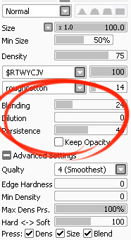
I’ve had a general idea what these things did but wasn’t completely sure what their specific functions were. I decided to sit down and figure it out, and I have thrown together a short reference guide for anyone who is confused about them. I know there are multiple translations of SAI floating around, so if some of these terms don’t sound familiar, just know that I’m talking about the three settings that appear under the texture in the brush tool settings (note that this won’t apply to any tool types except for brushesand watercolor brushes).
I don’t claim to be an expert so if you find I’ve made a mistake, let me know so I can update it, thanks! :3
—-
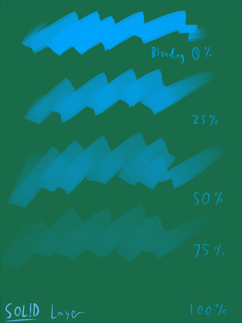
BLENDING (Color Blending)
This controls how readily the brush will inherit any colors you are painting over with it. For example, a 0% blending setting will pick up no existing colors, treating it as if you were painting on a transparent layer. A 100% blending setting will ONLY pick up existing colors (provided there are any). So at 100%, the color you’re using won’t even show up, unless you move to a transparent area. Blending is not affected by transparent pixels, so if you’re drawing on a blank layer it will have no effect.
So you can see from this example that the color I’m using gets harder to paint as the blending increases and more of the existing green is absorbed, until at 100% it is just completely turning green.
—-
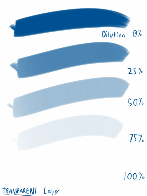
DILUTION (Opacity Mix)
This controls how readily the brush will draw on a blank (transparent) part of the layer. A 0% Dilution will result in the brush painting very easily onto a blank surface, while a brush with 100% dilution will literally not paint on blank parts of the layer at all. Dilution is ONLY affected by transparent pixels. So it won’t do anything if the whole layer is already filled in (even with white). Dilution can be thought of as the inverse of the Blending setting in some ways.
So in this example, you can see that as dilution approaches 100%, the color I’m painting with basically becomes invisible. In fact, if you were to switch to binary color mode and look at this layer, there would literally be nothing there anymore!
Keep this in mind – if you ever can’t paint for some reason, check your dilution setting, it might have gotten accidentally bumped to 100!
—-
PERSISTENCE
This one goes hand-in-hand with blending. Basically, it controls how easily a brush shifts color as you are blending from one color to another. Rather, how long it “persists” if you will. Like blending, Persistence is only really relevant when painting over existing color so it’s mostly unaffected by transparent pixels. Basically, the higher the persistence, the longer it will take for the color to shift as you make a stroke, and subsequently, from which color to which other color it is shifting is dependent on the blending setting.
So for this example I’ve done the same test with three different levels of blending. I turned off all pressure sensitivity (actually I just used my mouse) to emphasize the effects in a controlled environment:
If blending is at 0%, persistence fails to have any real effect. With pressure on, there is only the difference of having to push harder, but the results will be the same as far as I can tell.
At a happy medium of 50%, persistence increase causes the orange that the brush is picking up to last longer as it goes into the green, until it never shifts to blue at all.
At 100% blending, there was never any blue in the first place, because as we already know, full blending causes you to only pick up existing color. So the persistence setting changes only how fast the orange changes to green.
Persistence is dependent upon the blending settings, so having them somewhere in the middle will probably produce the most optimal results.
—-
CONCLUSION
Ultimately how you use these is up to you, and is largely dependent on what kind of brush you’re making and what it will be used for. And most of these settings are meant to be used together in unison, so play around with them a lot!
If you are confused, or not sure what settings you want or what settings you should be using, a safe bet is to put them all at about 50% – that will produce fairly average results that are easy to work with, and it’s easy to remember in case you want to experiment but don’t want to forget your settings in case you decide to switch back.
once you’ve updated to ios11 it’s under emergency sos! 💕
Here’s what it looks like for Android
This. And a Pepper spray !
BUT WHO TO CALL WHEN POLICE ABUSE?
HEY SO ANDROID HAS THIS TOO, AT LEAST ON THE S8 IF NOT ON OTHERS
It’s under Settings > Advanced Features > SOS
I was really glad to know iOS had this feature but worried about Android users, so I wanted to make sure everyone knew that they also have the option for this. Stay safe you guys!!
The external oblique is that muscle that covers the side of the torso (partly on the front and on the sides of the body).
It’s formed by 8 portions per side, each one attached to a rib: the upper fours – thoracic portion – can be seen as four fleshy stripes in hot males muscular figures, while the bottom fours – flankpad portion – are usually perceived as a one thick bulbous shape. The waist stays at the conjunction between thoracic and flankpad portion.
This muscle actually covers the frontal abs too with a super thin kind-of-like cartilaginous surface. Under the flankpads, a ligament goes from the ASIS of the hips down to the front of the pubic bone, with a thicker line that forms a rather visible “V” shape. On women, this fold of the groin is rather curved, while on men is more angular and since it’s extremely sexy, is also called Apollo’s belt (or Adonis’, if you prefer ^^).
The external oblique muscle helps you move your upper body, of course. With the help of other muscles, it lets you flex the vertebral column and bend at the waist to the front; it also assists in lateral flexion (see Cullen stretching down here), or to rotate your torso on the horizontal axis, so with your feet facing forward and your upper body facing sideways (like Ellyna). The muscle’s shape stretches or compresses when doing these movements, of course, so remember it when drawing certain poses. One more thing to notice in Ellyna’s pose is a “tension line” (force?) that goes from the muscles of the neck, through the strenum and down to the pubic bone, and helps describing this twisting movement.
Active verbs to use in a fight scene or an otherwise violent encounter, color-coded by severity (with red as most intense and purple as most mild), and categorized by type of fight.
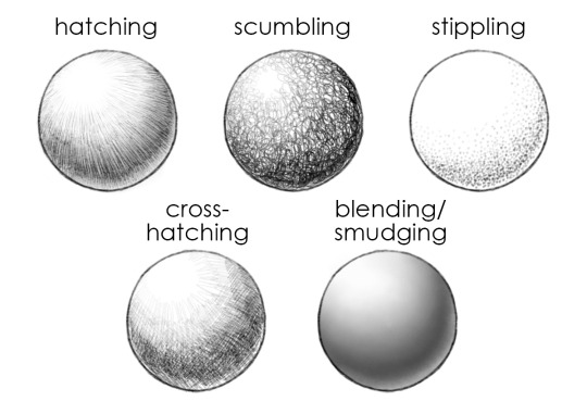
In Lesson Three, we talked about paying attention to light and shadow in shading forms. In this week’s post, we’re going to focus on shading techniques! Specifically, in how we create marks that build up to areas of shadow.
There are a number of different ways to apply drawn media to a page to create value. A few of them are:
break up your paragraphs. big paragraphs are scary, your readers will get scared
fuuuuck epithets. “the other man got up” “the taller woman sat down” “the blonde walked away” nahhh. call them by their names or rework the sentence. you can do so much better than this (exception: if the reader doesn’t know the character(s) you’re referring to yet, it’s a-okay to refer to them by an identifying trait)
blunette is not a thing
new speaker, new paragraph. please.
“said” is such a great word. use it. make sweet love to it. but don’t kill it
use “said” more than you use synonyms for it. that way the use of synonyms gets more exciting. getting a sudden description of how a character is saying something (screaming, mumbling, sighing) is more interesting that way.
if your summary says “I suck at summaries” or “story better than summary” you’re turning off the reader, my dude. your summary is supposed to be your hook. you gotta own it, just like you’re gonna own the story they’re about to read
follow long sentences w short ones and short ones w long ones. same goes for paragraphs
your writing is always better than you think it is. you just think it’s bad because the story’s always gonna be predicable to the one who’s writing it